
Understanding Color Psychology in Graphic Design
Understanding color psychology is the subject of graphic design services on how colors affect human thinking, emotions, and behavior. Color plays a vital role in affecting people’s lives in terms of making several decisions. That is why color psychology is so crucial for graphic design. Graphic designing is used for creating reports, advertisements, brochures, company logos, videos, and many other things. The color palette and combination used is what attracts people towards the specific advertisement, brochure logos, etc. so understanding color psychology is very important for graphic designers.
Different colors have different meanings. It can affect people of different backgrounds in different ways. Such as the color red is considered a very bridal color for most Hindu weddings and widely used in these ceremonies while red is not at all accepted for Christian weddings in the U.S. While the color white is used for wedding dresses and decor and is considered as pure in the U.S, it is a color of mourning for most people in Asian countries. Colors can make people decide what food to eat, which dresses to buy, how to decorate a place. The way a restaurant is designed, the colors used to design the restaurant can bring in loads of customers or none at all, depending on how attractive the place is visual.
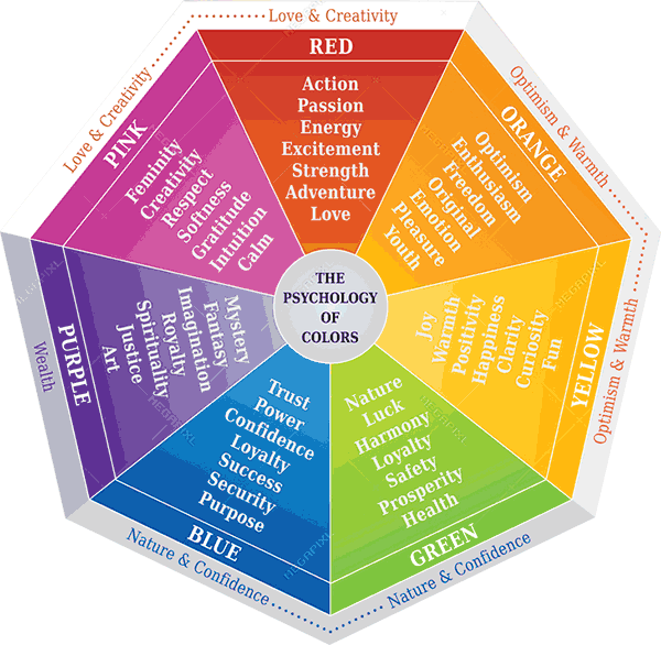
Here are some meanings of various colors:
Warm colors:
Warm colors represent energy.
Red:
Red is considered one of the most attractive colors. It is considered a color of power, passion, love, desire, energy, and determination. Red can also represent warmth, hospitality, comfort, friendship, and joy. Red also says luxury and wealth. It boosts appetite, metabolism, respiration, and blood pressure. This color also represents many negative things, such as danger, violence, warfare, fire, and anger.
Depending on what you want to represent, you can use red. If you’re going to make a sign which says danger or violence, use red. If you’re going to grab people’s attention for clicking on a button, use red in it. If you want to stimulate and increase someone’s energy and passion, use red.
Orange:
Orange is a mix of red and yellow, represents warmth, energy, affordability, earthiness, seasonal change, health, and creativity. It demands attention. This color is also linked with seasons like autumn and used accordingly. Orange can also represent colors of heartbreaks and disappointment.
Yellow:
Yellow represents happiness, cheerfulness, warmth, optimism, and positivist. Seeing something yellow can give satisfaction. It is almost as attractive as red, but too much yellow can give rise to negative feelings like anxiety, fear, low self-esteem, frustration, anger, insecurity, isolation, and many more. That is why it is wise to use yellow in a balanced way- too much yellow can have negative effects instead. Soft and light yellows can be used for children’s toys, clothes, and accessories. Dark yellow and gold can be used for luxury and an antique look. These can be used for designing different sites, advertisements, logos accordingly.
Red, orange, yellow colors in decor, plates, food all increase appetite and cause people to want more food subconsciously, thus ordering more food. So, warm colors play an essential role in restaurants and food. This strategy can also be used in graphic designing.
Cool colors:
Cool colors represent calmness.
Blue:
Blue is the color of seas and skies, represents calmness, peace, refreshment, serene, balance, reliability, responsibility, stability, tranquility, professionalism, authority, and serenity. It also represents intelligence and confidence, that is why it is used as a corporate color and a color of science and technology. Blues make human metabolism slow down and make them more relaxed. That is why the soft blues are used in baby products and deep blues in corporations and to represent strength and technology. But too much blue color can cause negative feelings like melancholy, distance, depression, and self-contentedness so it must be used wisely.
Green:
Green is a color of nature. It represents nature, environment, life, growth, new beginnings, renewal, peace, harmony, balance, and fertility. It also shows power, money, wealth, banking, and ambition. Some negative things represented by color green are greed, jealousy, and lack of experience. The color green has soothing and healing effects. It is also suitable for eyesight. Green can be used for anything representing nature, renewal, and money.
Purple:
Purple is a mix of blue and red has a mystical, spiritual, mysterious, and magical aura. It also represents nobility, royalty, power, luxury, ambition, maturity, purity, delicacy, and creativity. Soft purples can be used in designs of beauty, romance, and delicacy. Deep purples can be used for luxury, glam, sophistication, and elegance. Using this can make magazines attractive and give the reader a sense of luxury and power.
Neutral colors:
White:
White is a mixture of all the major color spectrum, represents light, peace, purity, innocence, beginnings, cleanliness, healthcare, guidance, simplicity, etc. As the color white is a calm color, it helps with a good thought, mental development, and purification. It also represents winter and snow. The color white may sometimes make things look dull, uninteresting, impersonal, and sterile. White may even be a bridal color or a mourning color depending on the culture of people. People are emphasizing more on simplicity as time goes by, so it is an excellent idea to use the color white in various designs and logos. White can also be used as a background to let other colors pop up and look impressive. White also plays a significant role in minimalist designs.
Black:
Black shows the strength, power, elegance, class, sophistication, mystery, and magic. It gives an extra feeling of confidence. Black is also used a lot for formals. Even though black represents all these positive things, it also represents sadness, mourning, evil, and bad luck. Black can be used in conventional designs, backgrounds, etc. to give an aura of mystery, confidence, and power.
Brown:
Brown can give a feeling of warmth, comfort, humbleness, reliability, trust, dependability, and family bonding. Using brown in your designs can take you back to nature, make you feel relaxed and give an earthy feeling. It also provides a sense of balance wherever you use it.
Colors used in graphic designs can influence a person in many ways. Seeing the right color combination can make a person’s day happy or sad. It can boost the confidence of someone. Various color combinations can represent various things for people of a different culture, so before designing anything for anyone, it is very important to understand what that person wants and his/her background to truly capture the essence of the topic.
Comments
No comment yet.