
Responsive Web Design: Why Mobile-Friendly Websites Matter
What is responsive web design?
Responsive web design is an approach to website design and development that allows a website’s layout, content, images, and interactive elements to adapt to different screen sizes. It helps websites provide a usable experience across smartphones, tablets, laptops, and desktop computers.
Responsive Web Design: Why Mobile-Friendly Websites Matter
Think about the last time you visited a website from your phone. If the text was too small, the menu was difficult to use, or you had to scroll sideways just to read a sentence, you probably left the site.
That is exactly why responsive web design matters.
People use different devices to browse websites, including smartphones, tablets, laptops, and desktop computers. A responsive website adjusts its layout and content to fit the screen being used, making the experience easier and more comfortable.
For businesses, responsive design is not simply about making a website look good on mobile. It also affects usability, accessibility, performance, SEO, and how easily visitors can interact with your business.
What Is Responsive Web Design?
Responsive web design is an approach to website design and development where a website automatically adapts its layout and content to different screen sizes and devices.
Instead of creating completely separate websites for desktop and mobile users, a responsive website uses flexible layouts, images, typography, and other design elements that adjust according to the available screen space.
A responsive website should work properly on:
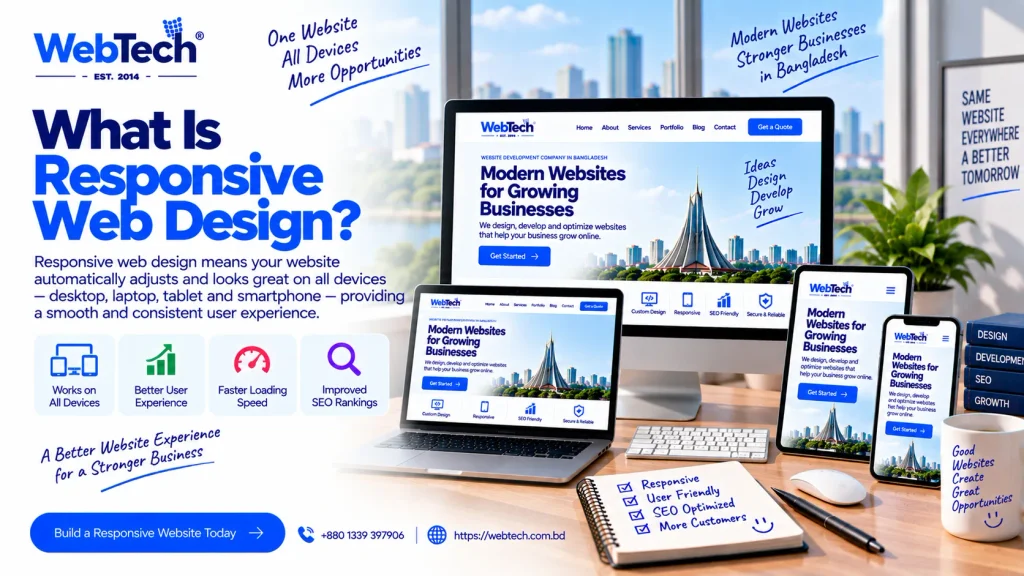
- Smartphones
- Tablets
- Laptops
- Desktop computers
- Different screen resolutions
The goal is simple: the website should remain easy to use regardless of the device.
How Does Responsive Web Design Work?
Responsive websites generally use flexible layouts and CSS techniques to adapt the page according to the user’s screen size.
For example, a desktop website may display three service cards next to each other. On a smartphone, those same cards may appear one below another.
Similarly:
- Navigation menus can change for smaller screens
- Images can resize automatically
- Text can adjust for readability
- Columns can stack vertically
- Buttons can become easier to tap
- Spacing can change based on screen size
This allows one website to provide a consistent experience across different devices.
Responsive Web Design vs Mobile Website
Responsive web design and a separate mobile website are not exactly the same thing.
A responsive website uses the same website structure and adapts its layout to different screen sizes.
A separate mobile website may use a different version or structure specifically for mobile visitors.
For most modern websites, responsive design provides a practical way to maintain a consistent experience across devices without managing completely separate desktop and mobile websites.
Why Are Mobile-Friendly Websites Important?
A large portion of website visitors may access your website through smartphones.
If the website is difficult to use on a small screen, visitors may struggle to:
- Read your content
- Navigate the website
- Fill out forms
- Find contact information
- View products
- Complete purchases
- Request a quotation
A mobile-friendly website removes many of these unnecessary obstacles.
For a business, that matters because a visitor who cannot easily use your website may simply move to another option.
Benefits of Responsive Web Design
Responsive design offers several practical benefits for businesses and website owners.
1. Better User Experience
Visitors should not have to zoom in, scroll sideways, or fight with a tiny menu.
A responsive layout adapts to the available screen size, making navigation and content easier to use.
Good user experience is especially important for websites that depend on enquiries, bookings, product sales, or other conversions.
2. One Website for Multiple Devices
With responsive web design, you generally maintain one website that adapts to different devices.
This can make website management easier because you don’t have to maintain separate desktop and mobile versions of the same content.
When you update a page, the change can be reflected across supported screen sizes.
3. Better Mobile Usability
Responsive design helps make important website elements easier to interact with on mobile devices.
For example:
- Buttons can have sufficient space
- Menus can be easier to open
- Forms can fit smaller screens
- Images can scale properly
- Text can remain readable
These small details can make a significant difference to the overall experience.
4. Supports SEO
Responsive design can support SEO because search engines need to understand and access your website content across devices.
A mobile-friendly website also provides a better experience for users who arrive from search results on smartphones.
However, responsive design alone does not guarantee higher rankings.
SEO also depends on factors such as:
- Content quality
- Search intent
- Technical SEO
- Website structure
- Internal linking
- Page speed
- Search relevance
- Website authority
Responsive design should therefore be considered part of a broader SEO-friendly website strategy.
5. Easier Website Management
Managing one responsive website is often simpler than maintaining separate desktop and mobile websites.
You can manage:
- Content
- Images
- Blog posts
- Products
- Service pages
- Forms
- Navigation
from the same website system.
This can make ongoing content updates more straightforward.
6. Better Conversion Experience
Imagine someone searches for your service on their phone and lands on your website.
If they immediately see:
- A clear headline
- Easy navigation
- A visible phone number
- A simple enquiry button
- Readable service information
they have a much easier path toward contacting your business.
Responsive Design and User Experience
Responsive design is closely connected with UX, or user experience.
A website can technically fit a mobile screen and still provide a poor experience.
For example, the website may technically be responsive, but:
- Buttons could be too close together
- Text could be difficult to read
- Important information could be buried
- Pop-ups could cover the content
- Forms could be frustrating to complete
- Navigation could be confusing
This is why responsive design should focus on how people actually use the website, not just whether the layout technically shrinks.
Mobile-First Thinking
A mobile-first approach means considering smaller screens early in the design process rather than designing only for desktop first and fixing mobile issues later.
This encourages designers and developers to prioritize:
- Important content
- Simple navigation
- Clear calls to action
- Readability
- Touch-friendly controls
- Efficient layouts
Mobile-first design can be particularly useful when a significant portion of a website’s audience uses smartphones.
Responsive Design and SEO
Responsive design and SEO often work together, but they are not the same thing.
SEO focuses on helping search engines understand and surface relevant content for users.
Responsive design focuses on making the website usable across different devices.
The two can support each other through:
- Mobile-friendly layouts
- Clear content structure
- Easy navigation
- Accessible content
- Fast-loading pages
- Consistent URLs
- Proper internal linking
- Optimized images
A technically responsive website still needs useful content and strong SEO fundamentals to perform well in organic search.
Responsive Design and Website Speed
Responsive websites should also be designed with performance in mind.
A common mistake is creating a responsive website that technically works on mobile but loads extremely large images, scripts, videos, and animations.
That can create a poor experience for visitors, especially on slower mobile connections.
Performance considerations can include:
- Compressing images
- Using appropriate image formats
- Serving responsive image sizes
- Reducing unnecessary scripts
- Optimizing fonts
- Using caching
- Improving server response time
- Removing unnecessary design elements
Website performance can also be evaluated through metrics such as Core Web Vitals.
Responsive design and speed optimization should therefore be considered together.
Responsive Web Design for Business Websites
A business website should make it easy for visitors to understand what the company offers and how to contact it.
On mobile devices, important elements may include:
- Company name
- Main services
- Contact number
- WhatsApp or enquiry option
- Location
- Service areas
- Calls to action
- Contact forms
A responsive business website should keep these elements accessible without making the visitor search through multiple pages.
Responsive Web Design for eCommerce Websites
Responsive design is particularly important for online stores.
Customers may browse products from their smartphones while commuting, relaxing at home, or comparing different products.

An eCommerce website should make it easy to:
- Browse categories
- Search for products
- Filter products
- View product images
- Read product information
- Select variations
- Add products to the cart
- Complete checkout
If any of these steps become difficult on mobile, customers may abandon the purchase.
Responsive eCommerce design should therefore consider the complete shopping journey, not just the homepage.
How to Check if a Website Is Mobile-Friendly
You don’t need to be a developer to perform a basic mobile usability check.
Open your website on a smartphone and ask:
- Can I read the text without zooming?
- Is the menu easy to use?
- Can I tap buttons comfortably?
- Do images fit the screen?
- Are forms easy to complete?
- Can I find the contact information quickly?
- Does the page load reasonably quickly?
- Is anything cut off?
- Do pop-ups interfere with the content?
Also test the website on multiple screen sizes if possible.
A website that works perfectly on one phone may still have layout problems on another screen.
Common Responsive Web Design Problems
Even websites that are technically responsive can have usability issues.
Common problems include:
Tiny Text
Text that looks acceptable on a large desktop screen may become difficult to read on a phone.
Small Buttons
Buttons should be easy to tap without accidentally clicking another element.
Horizontal Scrolling
Visitors should not normally have to scroll sideways to view basic website content.
Oversized Images
Large images can create unnecessary loading time and consume mobile data.
Difficult Navigation
A complicated desktop navigation menu may need to be simplified for smaller screens.
Intrusive Pop-Ups
Pop-ups that cover most of the screen can make it difficult for mobile visitors to access content.
Poorly Designed Forms
Long or complicated forms can be frustrating on smartphones.
Responsive Web Design Best Practices
A good responsive website should follow practical design principles.
Use Flexible Layouts
Layouts should adapt naturally to different screen sizes.
Optimize Images
Use appropriately sized and compressed images rather than serving unnecessarily large files.
Keep Navigation Simple
Mobile menus should make important pages easy to find.
Make Buttons Easy to Tap
Calls to action should have enough space and should be visually clear.
Prioritize Important Content
Visitors should see the most important information without unnecessary scrolling.
Test Across Devices
Test the website on different smartphones, tablets, laptops, and desktop screens.
Consider Performance
Avoid unnecessary animations, scripts, and large assets that can slow the site.
Maintain Readability
Font sizes, line spacing, contrast, and content width should support comfortable reading.
Responsive Web Design for Local Businesses in Bangladesh
For local businesses in Bangladesh, mobile-friendly design can be especially useful because customers may search for services while they are away from a desktop computer.
For example, someone searching for:
- Website development company in Dhaka
- Dentist in Uttara
- Restaurant near me
- Interior designer in Dhaka
- Pest control service in Bangladesh
may arrive on a website from a smartphone.
The website should make it easy for that visitor to understand the service, location, contact information, and next step.
Responsive design can therefore support the broader local SEO and customer journey, although it is only one part of local search optimization.
Responsive Web Design and Accessibility
Accessibility.
A website should aim to remain usable for people with different abilities and browsing preferences.
Practical considerations include:
- Readable text
- Sufficient contrast
- Clear navigation
- Descriptive links
- Proper heading structure
- Accessible forms
- Alternative text for meaningful images
- Keyboard-friendly interactions where applicable
Accessibility and responsive design are different disciplines, but both contribute to a more usable website.
How Responsive Web Design Fits Into Website Development
Responsive design is not a separate feature that should simply be added at the end.
It should be considered throughout the website development process.
A typical workflow may look like:
Planning → Sitemap → UI/UX Design → Responsive Design → Development → Content Integration → Testing → SEO → Performance Optimization → Launch
Testing should happen at multiple stages rather than only after the website is finished.
This makes it easier to identify layout problems before they become expensive to fix.
Responsive Web Design Services in Bangladesh
Businesses looking for responsive website design in Bangladesh should compare providers based on more than visual appearance.
Consider:
- Portfolio
- UI/UX experience
- Mobile responsiveness
- Development technology
- SEO knowledge
- Website performance
- Security
- Pricing
- Support
- Maintenance
The goal is to build a website that works well for both your customers and your business.
WebTech Responsive Website Design and Development
If you’re looking for responsive website design in Bangladesh, WebTech provides website design and development solutions for businesses that need websites that work across different devices.
Depending on the project, services can include:
- Responsive website design
- UI/UX design
- Business website development
- Corporate website development
- eCommerce website development
- WordPress website development
- Custom website development
- SEO-friendly website development
- Website speed optimization
- Website maintenance
The exact approach depends on your business goals, audience, website structure, functionality, and budget.
If you’re comparing website design and development companies, review their portfolio and test their existing websites on mobile before making a decision.
Final Checklist for a Responsive Website
Before launching your website, check:
- Does the website work on smartphones?
- Does it work on tablets?
- Is the text easy to read?
- Are buttons easy to tap?
- Does the navigation work properly?
- Do images fit different screens?
- Are forms usable on mobile?
- Is the website reasonably fast?
- Are important pages easy to find?
- Does the design support SEO?
- Have different browsers and devices been tested?
- Are unnecessary pop-ups avoided?
- Is the website accessible and easy to navigate?
A responsive website should not simply fit the screen. It should provide a comfortable and useful experience.
Frequently Asked Questions
What is responsive web design?
Responsive web design is an approach to designing and developing websites so that their layout, content, images, and interactive elements adapt to different screen sizes and devices.
Why is responsive web design important?
Responsive web design helps visitors use a website comfortably across smartphones, tablets, laptops, and desktop computers. It can improve mobile usability, user experience, and the technical foundation for SEO.
Is responsive web design important for SEO?
Yes, responsive design can support SEO by providing a mobile-friendly experience, consistent website structure, usable navigation, and accessible content. However, responsive design alone does not guarantee search rankings.
What is the difference between responsive design and mobile-friendly design?
Responsive design is a specific approach where a website adapts its layout to different screen sizes. Mobile-friendly is a broader term describing a website that is easy to use on mobile devices.
How do I know if my website is responsive?
Open your website on different devices and screen sizes. Check whether the content fits the screen, navigation works, text is readable, buttons are easy to tap, and there is no unnecessary horizontal scrolling.
Does responsive design improve website speed?
Responsive design itself does not automatically make a website faster. Performance depends on factors such as image size, scripts, hosting, caching, code, and other technical elements. A responsive website should therefore be designed and optimized with performance in mind.
Is responsive design necessary for an eCommerce website?
Yes. Customers often browse and purchase products using smartphones. Responsive eCommerce design helps make product browsing, cart management, and checkout easier across different devices.
How much does responsive web design cost in Bangladesh?
The cost depends on the website’s size, design complexity, number of pages, platform, functionality, UI/UX requirements, eCommerce features, and development work involved.
Conclusion
Responsive web design is no longer simply about making a desktop website fit on a smartphone.
A good responsive website should make content easy to read, navigation simple, buttons usable, forms accessible, and important business information easy to find across different devices.
It should also work alongside SEO, performance, accessibility, security, and a well-planned website structure.
If you’re planning a new website or redesigning an existing one, consider responsive design from the beginning rather than treating mobile usability as a final adjustment.
For businesses in Bangladesh, choosing a website design and development company that understands both user experience and technical implementation can help create a website that is useful today and easier to improve as your business grows.
Comments
Comments are closed.